© 2024 RAMSTHEMES. All rights reserved

Thank you very much for choosing RAMS. We truly appreciate and really hope that you’ll enjoy our theme and our future updates and improvements. If you have any questions or recommendations, feel free to contact us.
Requeriments
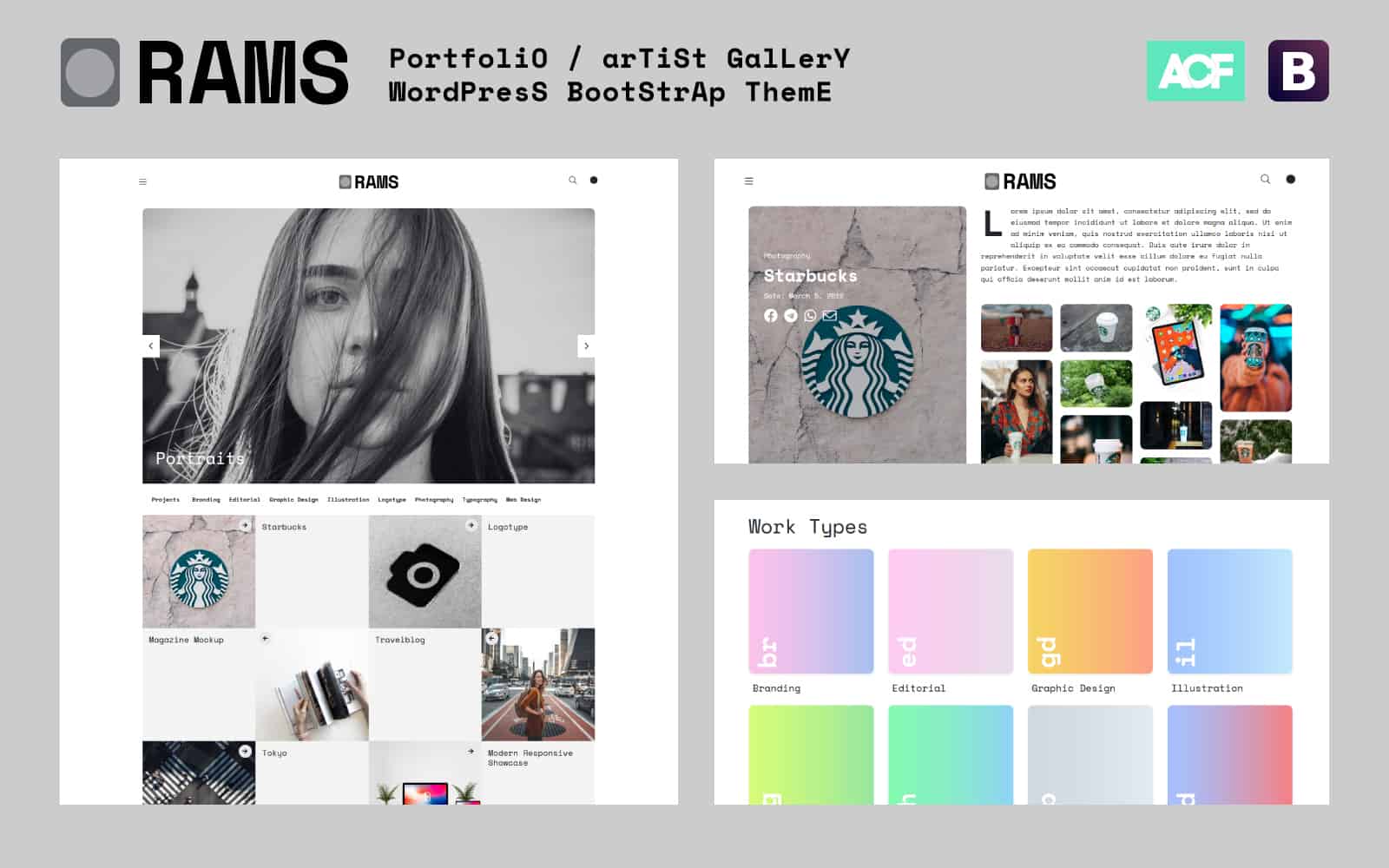
As you know, you can always visit the demo site.
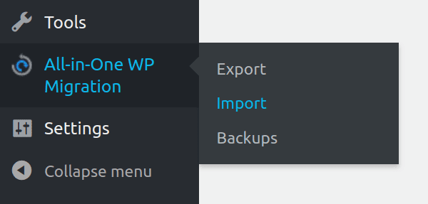
Import .wpress file from All-in-One WP Migration
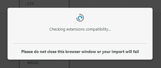
If you want to import the demo to your WordPress installation (looks exactly the same as demo site), when you make a clean install of WordPress on your server, first download the All-in-One WP Migration plugin and activate them. Now, go to Import page from the All-in-One WP Migration dropdown menu:
Once you have chosen the option, the application takes you to the Import page:
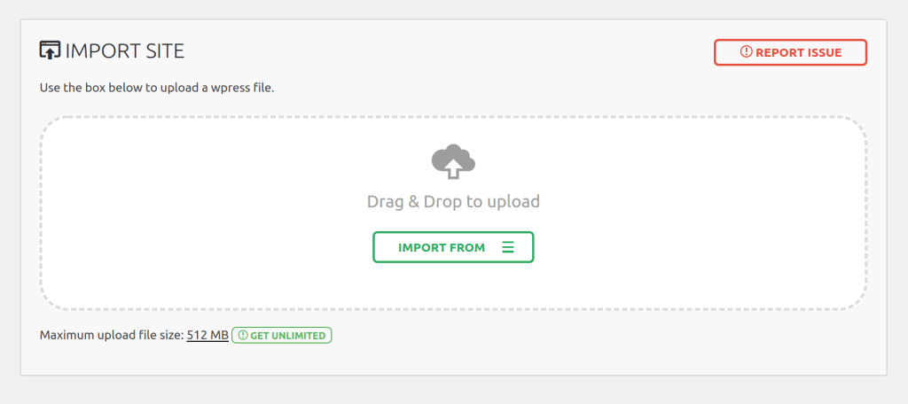
From this page you can select from where you want to import a backup using the dropdown menu:
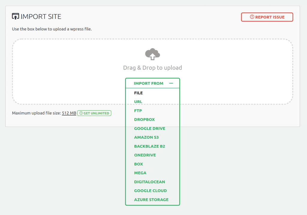
If you chose ‘File’, the plugin will open a window showing your local files and folders and will let you chose a backup for import from there. Then, find the file ramsdemo.wpress from the Demo Content folder. Next, choose them to begin the import process:
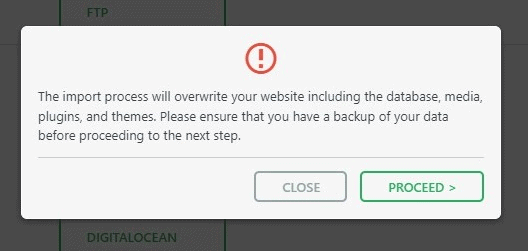
The import has an additional step which warns you that your website will be overwritten by the new backup including database, media, plugins and the activated theme. This is the last step from which you can cancel the process. After pressing ‘Proceed’ you cannot stop the import process anymore. The amount of time the import process will take depends on the size of the data and the speed of your internet connection.
Note: is important to previously check in your Hosting Service the File Size Upload option (512 MB recommended size or more, because the size of the import file is big)
When finished, a successful import will display this message:
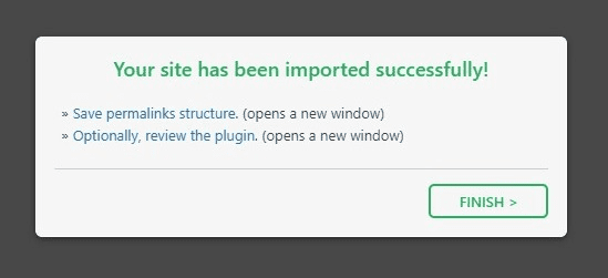
At this step, it is recommended to click on Permalinks Settings link and save your permalinks twice in order to save them and generate .htaccess file.
Also, because the demo imports the original database, your admin user and password keys will change to the included in Theme documentation file.
Please, enter with this keys to your dashboard and change them in the Users/Your profile section to whatever you want.
If you don’t want to import the demo file, the ideal is to install theme from a fresh WP installation, to customize the theme options and start uploading the contents.
When you purchase the theme, the downloaded zip file contains Theme files (it contains the zipped installable WordPress theme file)
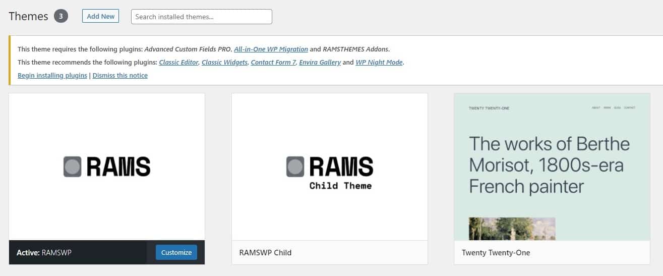
Extract the downloaded zip, and select the zip file ramswp.zip and ramswp-child.zip. Now, you have two ways for installing the theme:
1 – Install theme via WordPress Dashboard
Go to Appearance > Themes section and click Add New
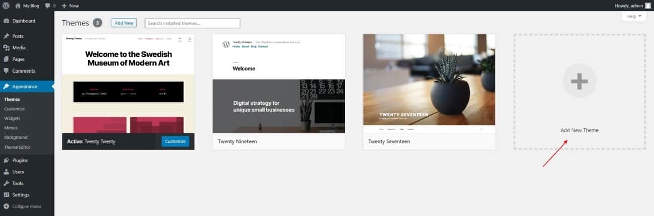
In the next screen click the Upload Theme button
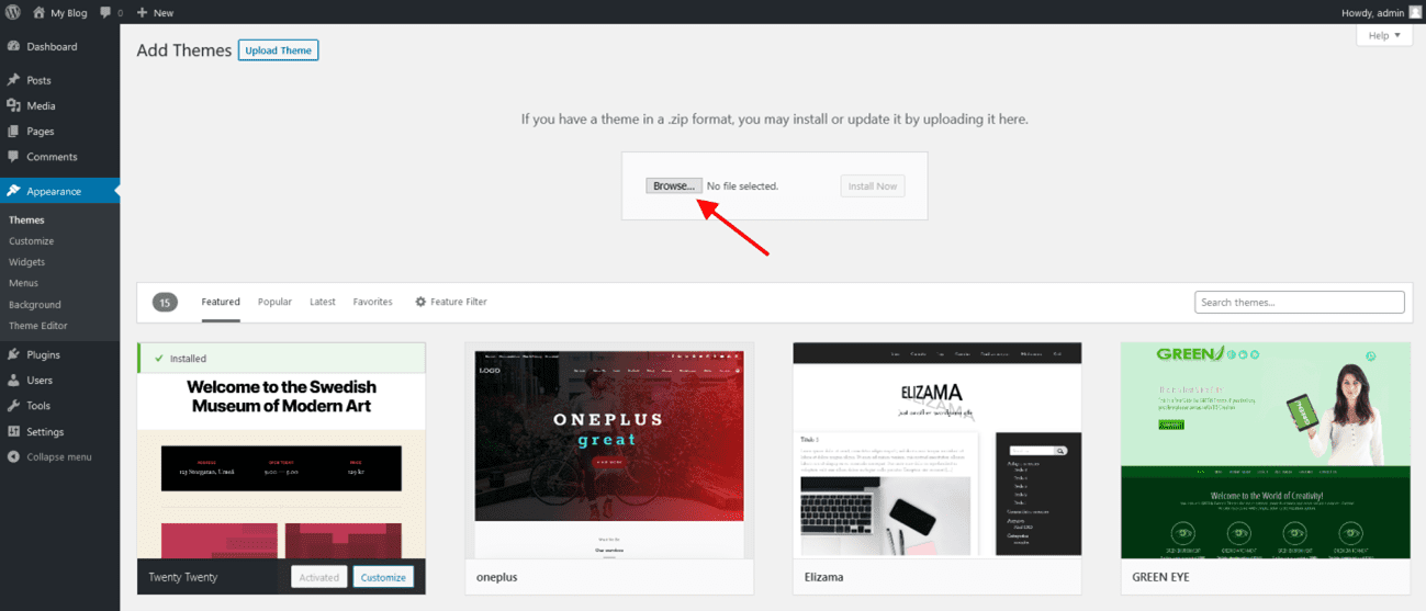
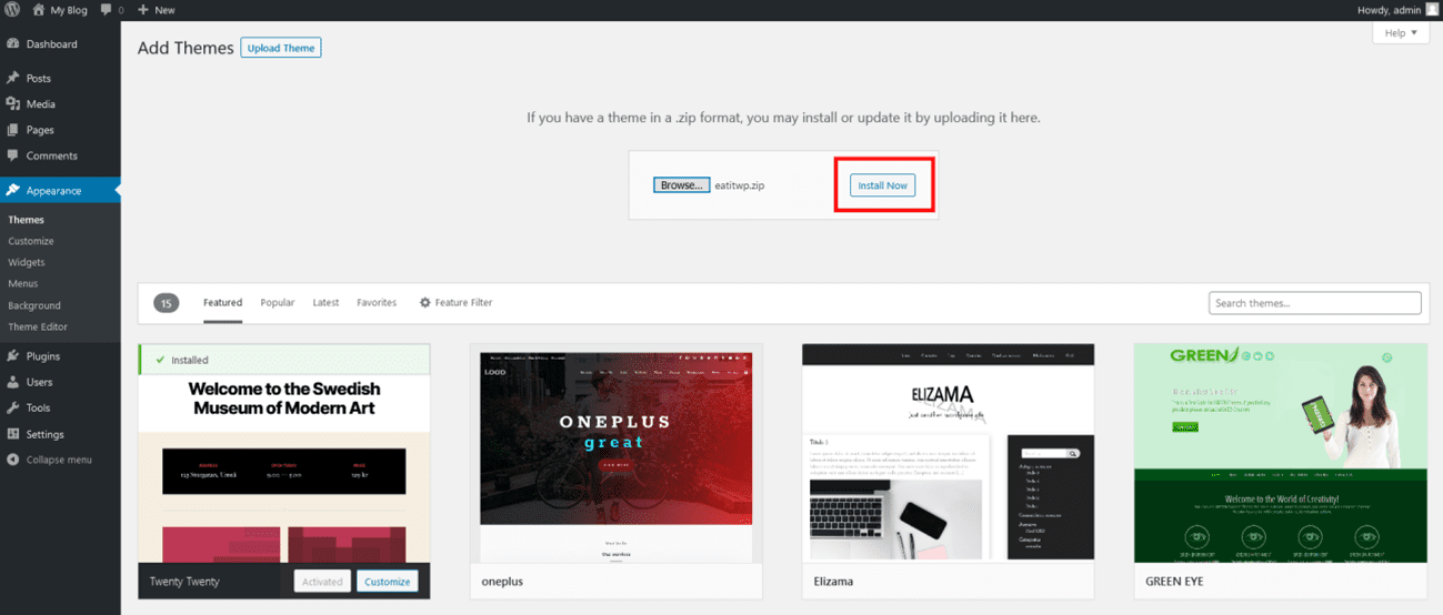
Click the Choose File button, select the zip file and click Install Now.
You can now activate the Parent Theme first, and optional the Child Theme (only for code customizations)
Child Theme
A child theme is a theme that has all the functionality and styling of another theme; referred to as the parent theme. Child themes are the recommended way of modifying the code of an existing theme, since a child theme preserves all custom code changes and modifications; even after a theme update. If you modify code directly from a parent theme, and then update the parent theme, your changes will be lost.
Although child themes can be a great way to add custom changes, they are most often used to customize core code taken from the parent theme. Because of this, please be aware that customizations of this nature fall outside our scope of support, and we will be unable to assist you with any issues that may arise. The child theme is primarily inserted in the package for developers’ convenience.
Always use a child theme when modifying core code. Child themes can also be used for custom CSS applications, template file modifications, and custom PHP functions and/or hooks. There are two ways to modify a child theme. Bear in mind that using child themes is no guarantee that an update of custom code on the parent theme will not require further maintenance.
If you want to make changes in theme’s templates or functions, we recommend that you install child theme and make changes there. To learn more about the purpose and basis of creation of child theme, visit WordPress Codex on Child Themes section.
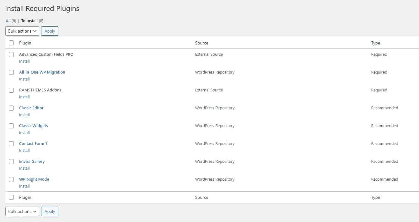
When you install and activate the Theme, there’ll be a message with a list of required and recommended plugins that can be installed.
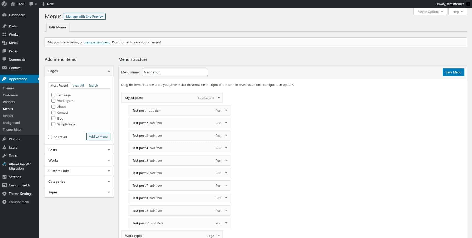
Go to Appareance – Menu in the Dashboard and build the menu with the elements you like. After that, check the “Display location” in Menu Settings and Save Menu to display it in the sidenav.
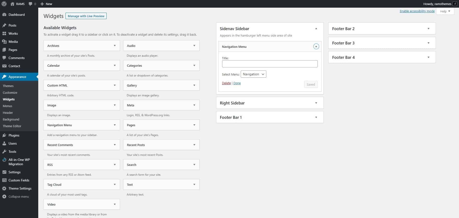
To display in the frontend, go to Appearance – Widgets and add the Navigation Menu to the Sidenav Sidebar
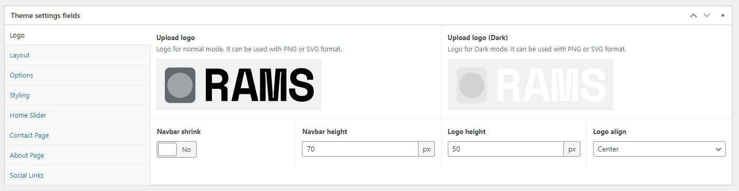
You can upload two logos, one for the Normal (light) mode and other for Dark mode, if you wish to enable them. Recommended logos in PNG or SVG format for better definition.
Other options are:
Navbar Shrink: shrink effect when you choose a bigger logo (major navbar and logo heights).
Navbar / Logo height: the height of the header navbar and/or logo in pixels.
Logo align: choose for center or left align.
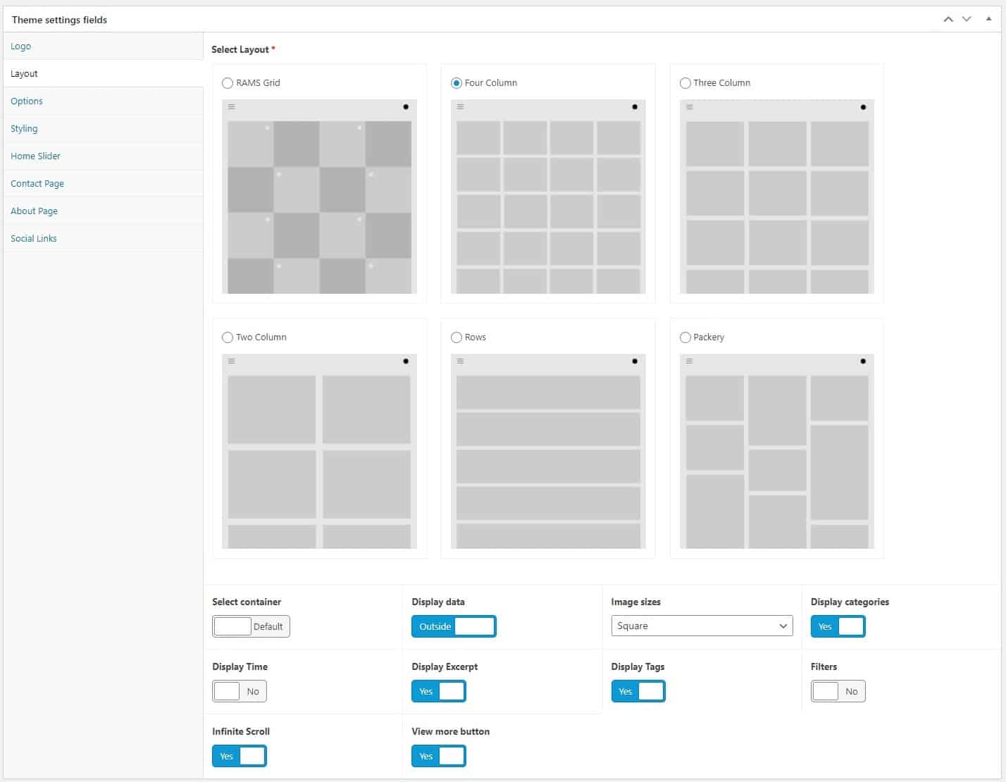
The Layouts applies to Home. All styles have common options with certain differences.
Common options
Select container: choose respecting Bootstrap Fluid container (similar to full-width) and default container (spacing on left and right).
Filters: enables filter buttons with Isotope. Use it disabling the Infinite Scroll and View More button, and choose a large number of works/posts to display (i.e, 30 or 50).
Projects text: the custom name for display the filters.
Infinite Scroll: enables the Infinite Scroll effect when scrolling down.
View more button: combines with the previous switch, enabling a button for show more posts.
Note: when the Infinite Scroll and View More buttons are disabled, the default WP paged navigation is automatically enabled.
1. RAMS Grid
Post box background: select a background color of the box containing the title near the image.
2. Four, Three, Two column and Rows
Display data: shows the info of the other buttons Outside (all) or Inside (date, categories and excerpt) the image.
Image sizes: sets the image on square or rectangular ratio.
Display Time: shows the date of post, configured on WP settings section.
Display excerpt: shows post excerpt.
Display categories: shows the categories assigned to post.
Display tags: shows the tags assigned to post.
3. Packery grid
Columns: select the column qty (from 2 to 5) for the grid, based on the grid-sizer function of Packery.
Display Time: shows the date of post, configured on WP settings section.
Display excerpt: shows post excerpt.
Display categories: shows the categories assigned to post.
Display tags: shows the tags assigned to post.

Search button on header: enable or disable a search box on the top-right corner of header, near the light-dark mode switch.
Use Fade effect for load pages: activate a simple fade effect when a page is loaded.
Activate Load Bar: activate a thin load bar when a page is loaded, similar to YouTube.
Load Bar color: select a custom color for the thin load bar when activated.
Fixed Navbar: changes the header to a fixed position, making the entire navbar visible when scrolling.
Border navbar: adds a border-bottom line to header navbar.
Border sinenav: adds a border-right line to sidenav menu.
Side menu font size: sets the size in px of the side menu sections.
Sidebar in pages: enables the same sidebar of posts in pages.
Rounded Corners: styles all the images and borders with a little rounded corner style, similar to an “app-like” style.
Share buttons: used for the share default social media buttons. Disable if you use your own plugin.
Capital Letter: enable or disable the Drop Cap in the beggining of a post text.
Select Archive Layout: choose the same layouts for home but applied to all WP archive pages and Blog.
Image sizes blog: sets the image on square or rectangular ratio.
Work / Types slug: change slugs for the post types and taxonomies. Recquires a refresh of Permalinks in WP settings.
Home title and Paragraph: adds a text above the layout init in the Home Page.
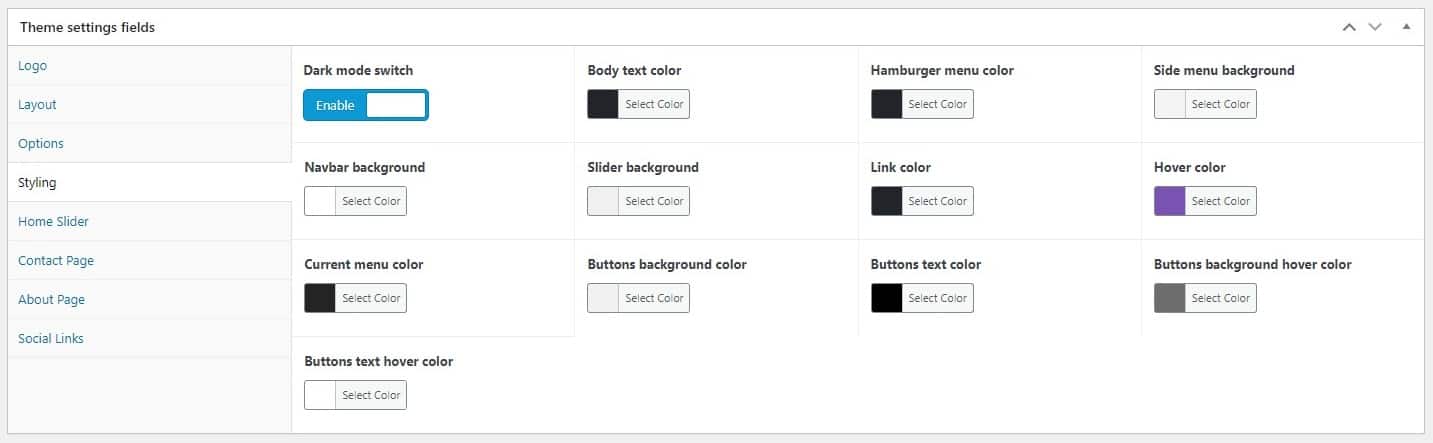
Dark Mode Switch: enable or disable the switch for the two modes on the top-right corner of the header.
Body text color: the general color of the texts.
Hamburger menu color: colorize the hamburger “three line” menu.
Side menu background: bg color for the sidenav displayed when the hamburger menu is pressed.
Navbar background: bg color of the header
Slider background: bg of the slider used as gallery on posts.
Link color: color for the links, or the <a> tag.
Hover color: color for the links when hovered.
Current Menu color: color for the links of current page (saw in side menu).
Buttons background color: bg of the custom button class.
Buttons text color: text color of the custom button class.
Buttons background hover color: bg of the custom button class when hover it.
Buttons text hover color: text of the custom button class when hover it.
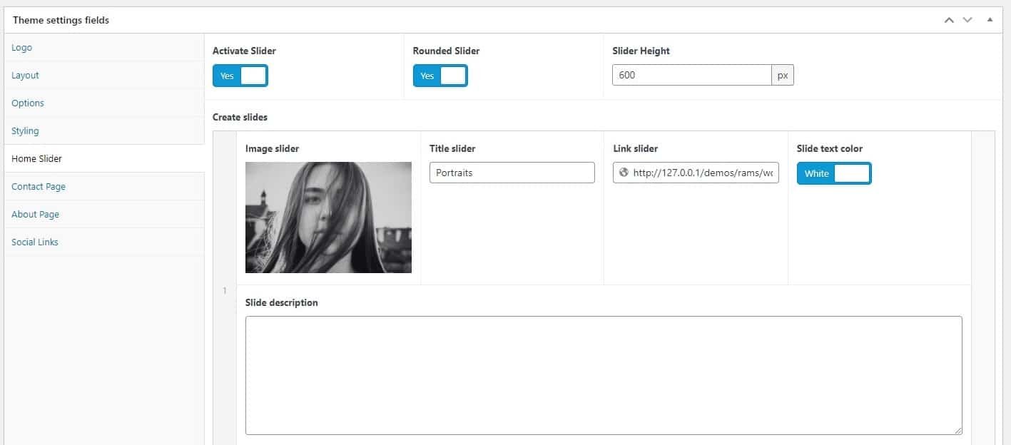
Complementing the Layout Selector, you can enable a slider for the homepage and add the slides what you want, uploading image, setting the titles and description, height, sets the color of texts (White for colored images or Dark for more light-background images) and linking them to anywhere. You can link featured posts you like or upload your own-designed slide.
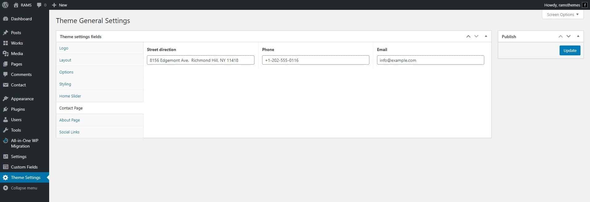
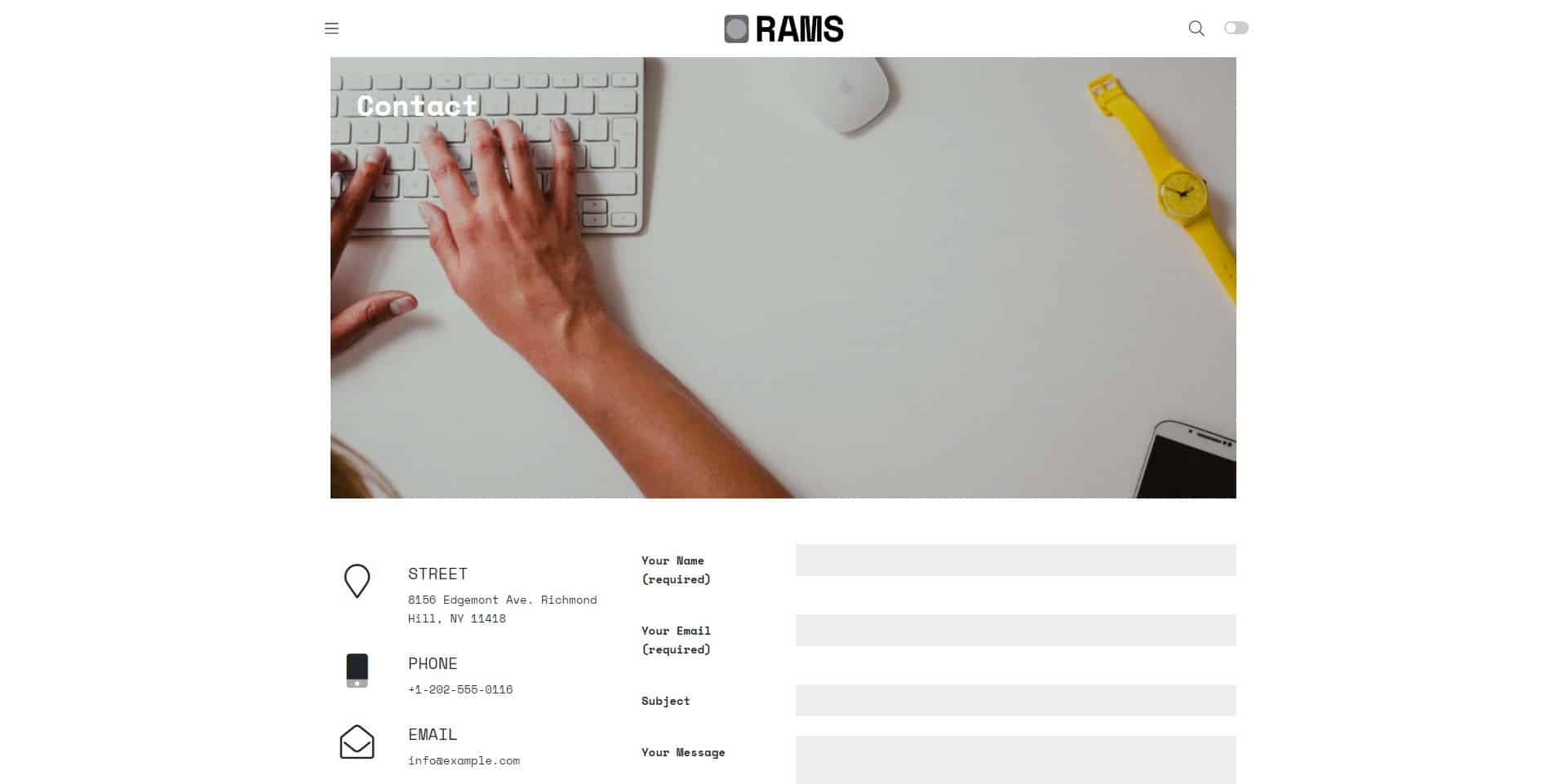
Sets your contact info and displays the shortcode of Contact Form 7 plugin to display a contact form. To set it up, go to “Pages” in your Dashboard and create a Page, and select the template “Contact” in the “Page Attributes” box. Paste the Contact Form 7 plugin generated shortcode in the plugin setings.
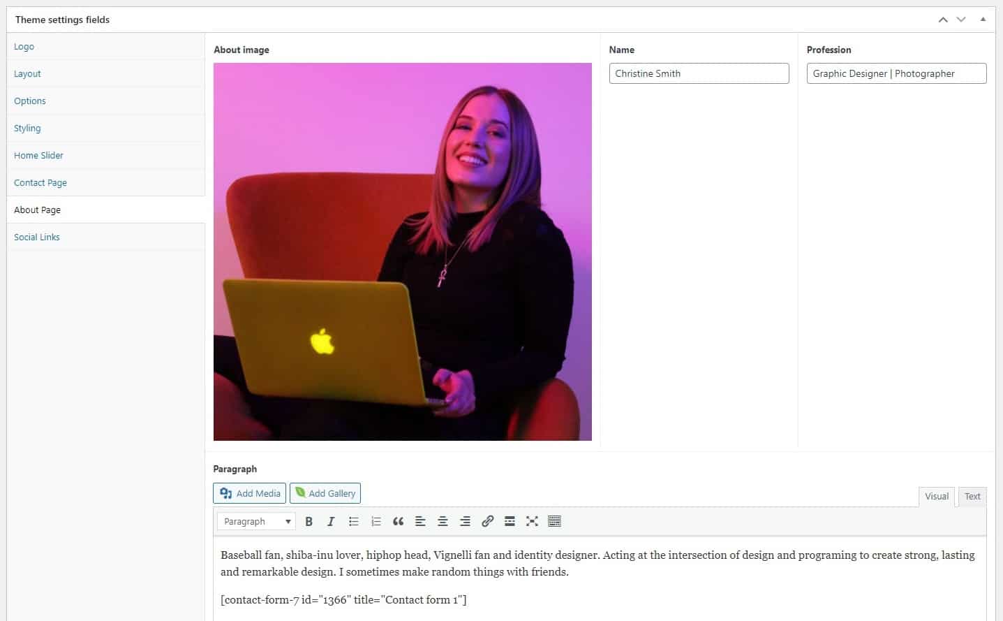
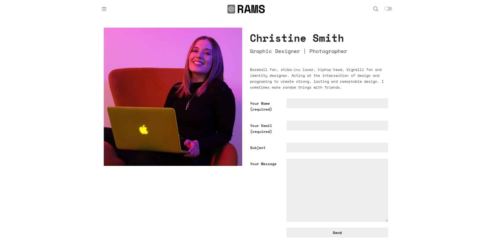
In this section you can add personal info in a editor and a nice photo. Also, you can combine the shortcode of Contact Form 7 plugin to display a contact form. To set it up, go to “Pages” in your Dashboard and create a Page, and select the template “About” in the “Page Attributes” box.

You can simply fill the fields with the url’s of your fav and active social media profiles.

“Works” post type are used for display every portfolio project in the homepage by default, taking the general layout settings reviewed in Section 7 of this docs. Also, every project have this options:
Post Style
Default: display the default structure of project, with the second featured image on top and text below with images or galleries in a long space.
Sticky Left / Right Image: displays the project with a half-grid module, with the second-ft-image on the left or right and the text, images or galleries on the left or right, similar to the editorial design of printed magazines.
Sticky Title: similar to the previous option, it only displays the title on the left and the content on the right.
Client: Fill if you want to display a field with Client name.
Demo site: Fill if you want to display a link with a url to a live site where your project is implemented.
Work Featured Image: enables a featured image different from the default ft. image (that be used in home and archives).
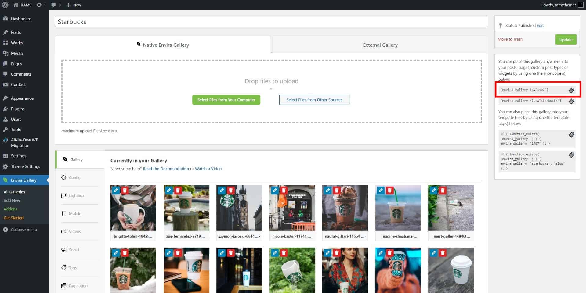
In posts or reviews, you can add the number of galleries you like selecting Envira Gallery plugin. You can use different types in the same post, because every gallery is generated by the plugin shortcode. Example: select and upload the images you like and, in copy and paste the Shortcode on Post or Work content. For example:
[envira-gallery id="1407"]
And then, do that with every gallery you want. For more information, check the documentation on the plugin author website.
Example in demo creating a Gallery:
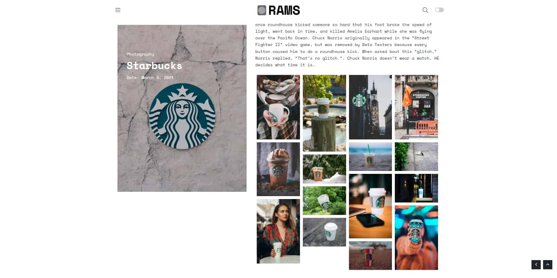
and the result
Single post are used for the Blog Section, if you want to create them. To set it up, go to “Pages” in your Dashboard and create a Page, and select the template “Blog” in the “Page Attributes” box. This page contains all posts only and takes the general layout settings reviewed in Section 7 of this docs.
Then, every post have this options. You can select custom options for display every post, and select the featured element:
Featured
1. Featured image
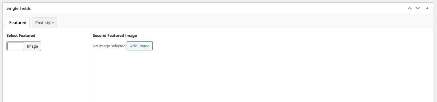
Enables a featured image different from the default ft. image (that be used in home and archives). It displays on the top of the post.
2. Featured video
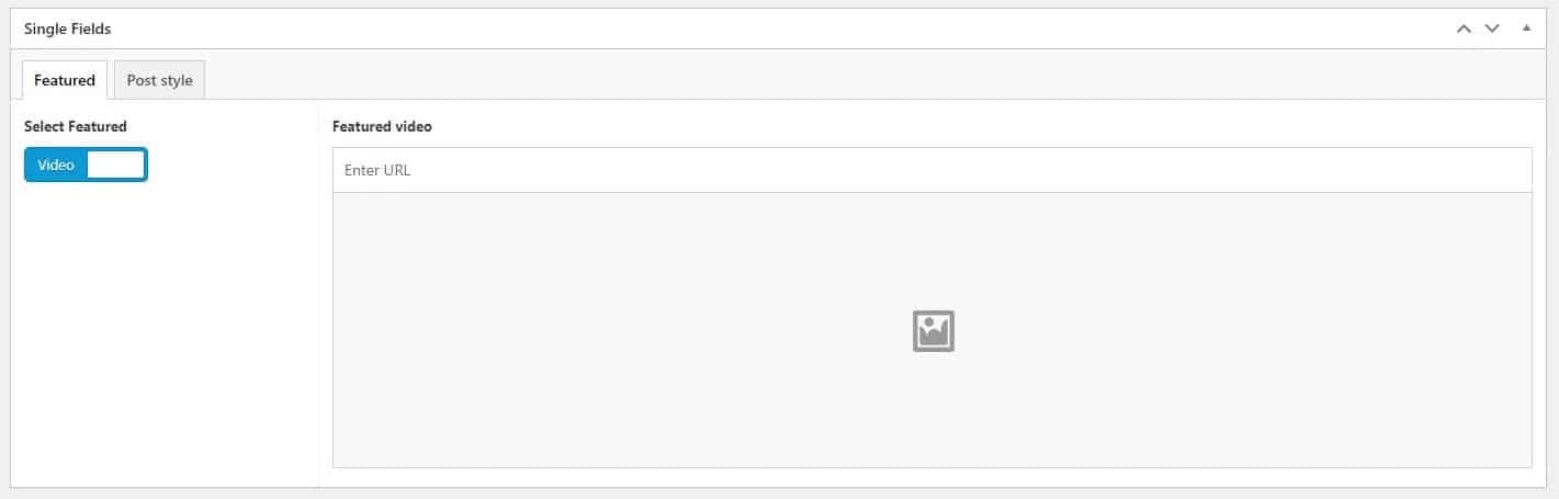
Enables a featured video in the same area. It embeds directly from the url generated from Youtube or other video services supported by WordPress oembed function.
Post Styles:
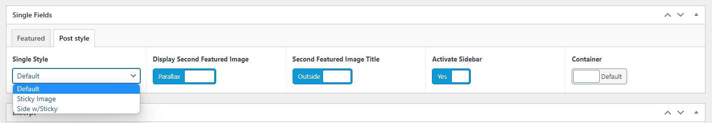
1. Default
Display the default structure of post, with the second featured image on top and text below. Also, you can select within this design:
Display Second Featured Image: Default (img in static common mode) or Parallax (adds the Parallax effect to img).
Second Featured Image Title: Inside the img or Outside, over the content.
Activate Sidebar: enable or disable the right sidebar which contains the Widgets you choose for the Sidebar on the Appearance – Widgets section.
2. Sticky Image
Displays the post with a half-grid module, with the second-ft-image on the left and the text on the right, similar to the editorial design of printed magazines.
Second Featured Image Title: Inside the img or Outside, over the content.
3. Sticky Title
Similar to the previous option, it only displays the title on the left and the content on the right, putting the second ft. image above the content text.
Extra: wide image on post
If you select a fluid container without sidebar, you can insert a wide image across the content.
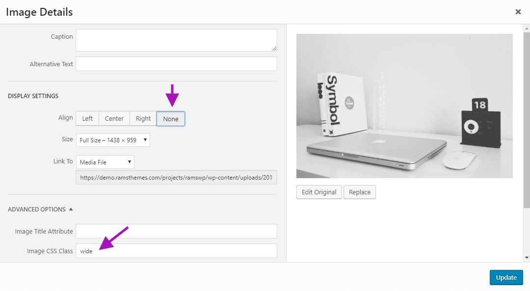
It can be configured when you add a full-size image to post, select “none” in Align, and add the CSS Class “wide” in the proper field.
* ACF Pro, © 2021 Delicious Brains, GNU GPL v2 or later.
* Bootstrap, © 2011-2021 The Bootstrap Authors, © 2011-2018 Twitter, Inc., MIT.
* PACE, © 2013-2018 HubSpot.
* Packery, © 2019 metafizzy, GNU GPL v3.
* Isotope, © 2019 metafizzy, GNU GPL v3.
* Flickity, © 2019 metafizzy, GNU GPL v3.
* Infinite Scroll, © 2019 metafizzy, GNU GPL v3.
* Images Loaded, © 2019 metafizzy, MIT.
* SimpleParallax, © 2017 Geoffrey Signorato, MIT.
* Font Awesome, © Fonticons, Inc.
* Bootstrap Comment Walker, 2017 Aymene Bourafai, GNU GPL v2.
* TGM Plugin Activation, 2016 Thomas Griffin, @GaryJones, @jrfnl, GNU GPL v2.